158th Anniversary
Our Brand History
In 1867, three brothers shared a bold vision and began a remarkable journey that would span generations. From its humble beginnings on a family farm in St. Louis, Missouri, Mallinckrodt has grown to become a global leader in specialty pharmaceuticals on a quest to improve the lives of patients around the world.
Immerse yourself in our story, and explore the milestones in our history that have defined Mallinckrodt’s legacy for the past 158 years.
Brand Evolution
Discover how Mallinckrodt’s logo and branding have evolved over the years.
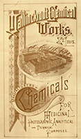
In the early 1880s, G. Mallinckrodt & Company incorporated in Missouri as Mallinckrodt Chemical Works. This is a brochure from that period, emphasizing the broadening business focus from medicinal chemicals to industrial chemicals, such as those for the emerging photography industry.
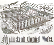
During the turn of the century, Mallinckrodt brochures and booklets frequently showcased an illustration of the company’s plant, with plumes of smokes rising from many stacks, a sign of economic progress during that period.
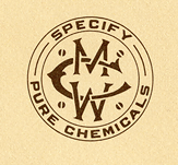
“Specify MCW” was Mallinckrodt’s first advertising slogan. It gave way, in the 1920s, to “The Standard of Comparison” and then “Bottle or Barrel, Mallinckrodt Spells Quality” in the 1930s.
In 1928, Mallinckrodt introduced a new script-based trademark, which would be used for the next 40 years. Legend has it that the script logo was the winning entry from an employee contest to design a new corporate symbol.
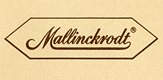
In the 1930s, Mallinckrodt enhanced its logo design to include a “benzene ring” shape around the script, bringing in a more chemical feature. The benzene ring represented the company’s positioning as a leader in the chemicals industry.

A major re-branding effort followed in the 1960s as the company cleaned up its trademark. A new singular logo was introduced, which eliminated the script logo used since the 1920s and replaced it with more modern block letters. The benzene ring shape remained intact.
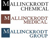
It was during this time that the next significant branding change was introduced. The new logo dropped the benzene ring, and introduced a simple square around the “M.” Branding for the separate companies—Mallinckrodt Chemical and Mallinckrodt Medical, which later became Mallinckrodt Group, are pictured.

Mallinckrodt’s logo got another refresh in 2000, after the company was acquired by Tyco. The Pharmaceuticals business version is shown; similar versions existed for Mallinckrodt Imaging and Mallinckrodt Respiratory.
The last major branding effort came in 2013 when Mallinckrodt became an independent public company again. The graphic cubes and triangles emphasize the ability to make complex products simpler, safer and better for patients. The hexagon shape draws on the benzene ring of past logos, acknowledging its rich heritage. And the center triangle pointing right emphasizes the forward-looking vision of the company.